Let’s face it, everyone you know is going to be invited to more than your wedding this year. Your save the dates are the first impression your guests will have of your wedding. This means you need YOURS to stand out so guests add your date to their calendar. In addition, you want your save the date to convey a fun and exciting tone for your wedding. In this blog post, we’ll show you how to make your save the date stand out among the overwhelming number of save the dates that gusts receive and make yours the one they attend. Bold save the dates are sure to make a lasting impression and get your guests to RSVP “heck yes”! :)
Bold Save the Dates to Make Yours Stand Out
When you decide to make your save the dates stand out, you’re essentially making your cards distinguishable from the rest. To do this, you need to add an identifying feature that is bold and unique There are four ways to single out your save the dates and make them look different. Let’s discuss each in detail so you can figure out how to make yours unique.
1. Choose an eye-catching design.
Which event do you think guests will be more drawn towards attending: the card with the same traditional design or one that stands out? An eye-catching design will do wonders in making your card practically pop right outta the mailbox and put that date on their calendar!
Look for unique elements that catch the eye, such as geometric shapes, vibrant colors, or unique illustrations. Here are some other attributes to consider.
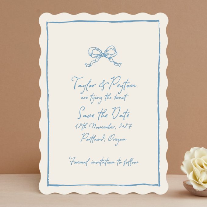
• Hand Drawn Designs
Send mini works of art to stand out in the mailbox, like these “tying the knot” cards, a fun play on words. By Cass Loh.
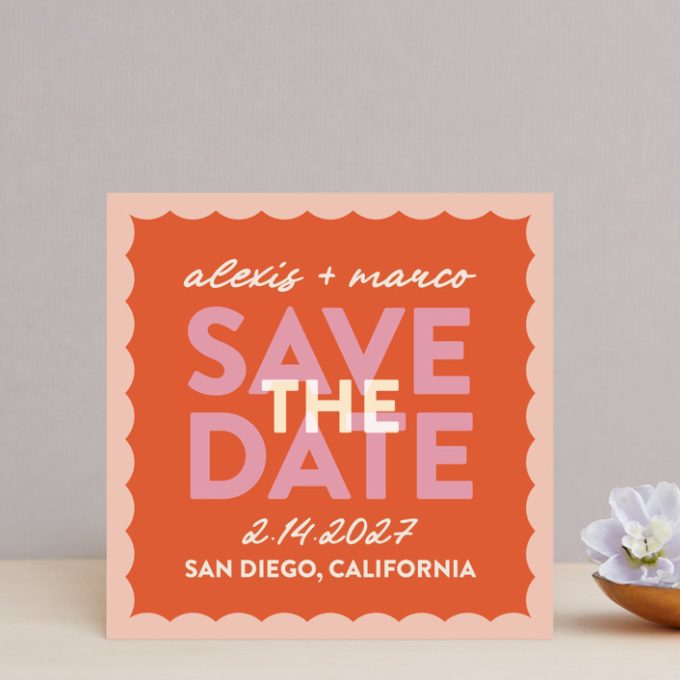
• Make It Unmissable with Color
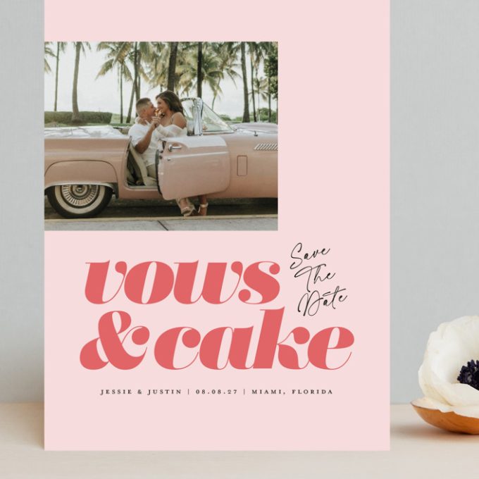
Say hello to bold colors, like this example by Carolyn Hunt, that guests won’t miss in the mailbox.
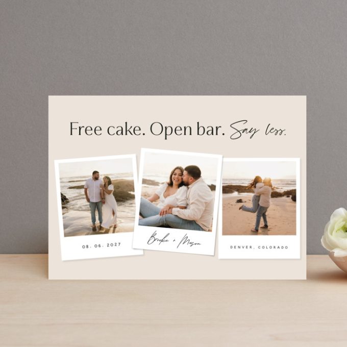
• Utilize Humor
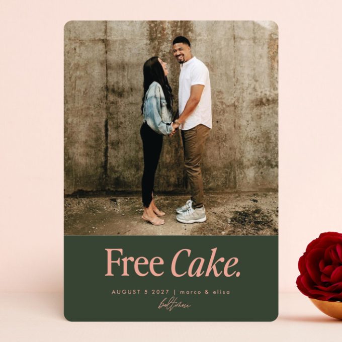
Send cards that make your guests chuckle! Funny save the dates like these “say less” save the dates by Stephanie Hawkes. Free cake? Say no more!
• Underscore Your Theme
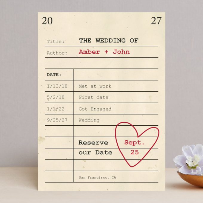
Planning a travel themed wedding? Going with a literary theme? Utilize it right from the start by including the design in your save the dates.
• Use Retro Inspo
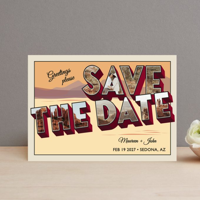
One major way to make save the dates stand out is by using a retro era look, like these travel-themed postcards. Fun!
2. Use bold typography.
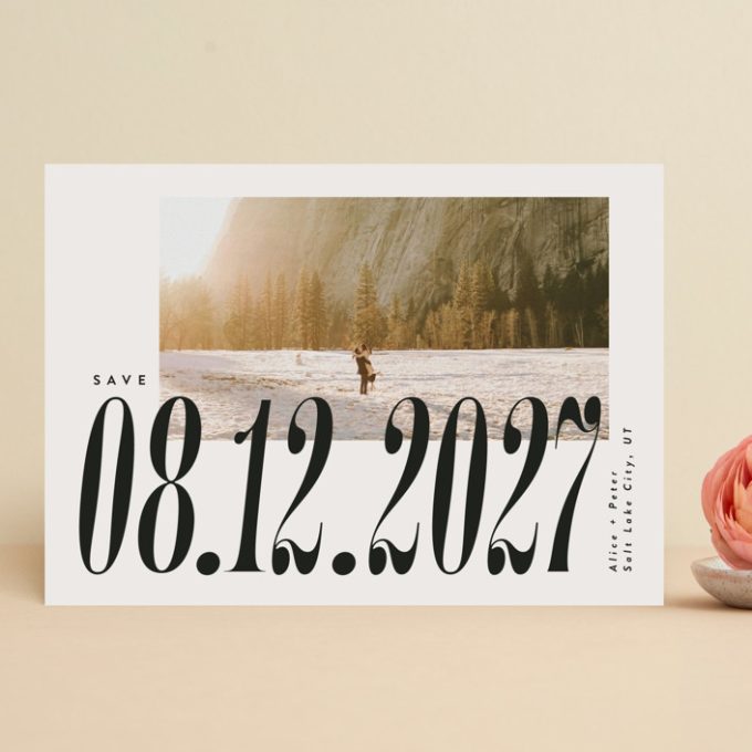
The font you choose is extremely powerful in creating a strong visual impact. Guests can’t save the date if they can’t see the date. Make it big, make it bold, and make it unforgettable.
3. Add a personal touch.
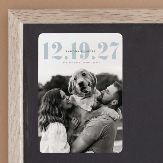
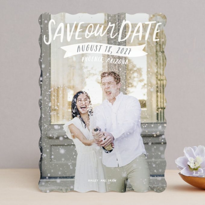
The most important element? Add something that is unique to your relationship. Photos, photo strips, pictures of you and your dog, travel pictures – these are the elements that really stand out!
4. Incorporate an interactive or digital element.
Give your guests a glimpse of the wedding day ahead by including a QR code on the back that links to your wedding website. (Get a free website here.) From there, they can (early) RSVP or see more details pertaining to the celebration. This will create excitement and anticipation for the wedding.
As you’ve seen here, it is important to make a strong first impression with bold save the dates. Get creative! Don’t be afraid to think outside the box when designing your save the dates. And remember to send them early, or on time: here’s a helpful calendar to assist.
ON TO YOU:
Ready to get guests on board for your big day? Get started here and browse stylish, personalized, and bold save the dates at Minted. Their eye-catching and customizable designs are sure to make a lasting impression on your guests.
Happy Planning!
xo
Emma
This is a sponsored post.
