
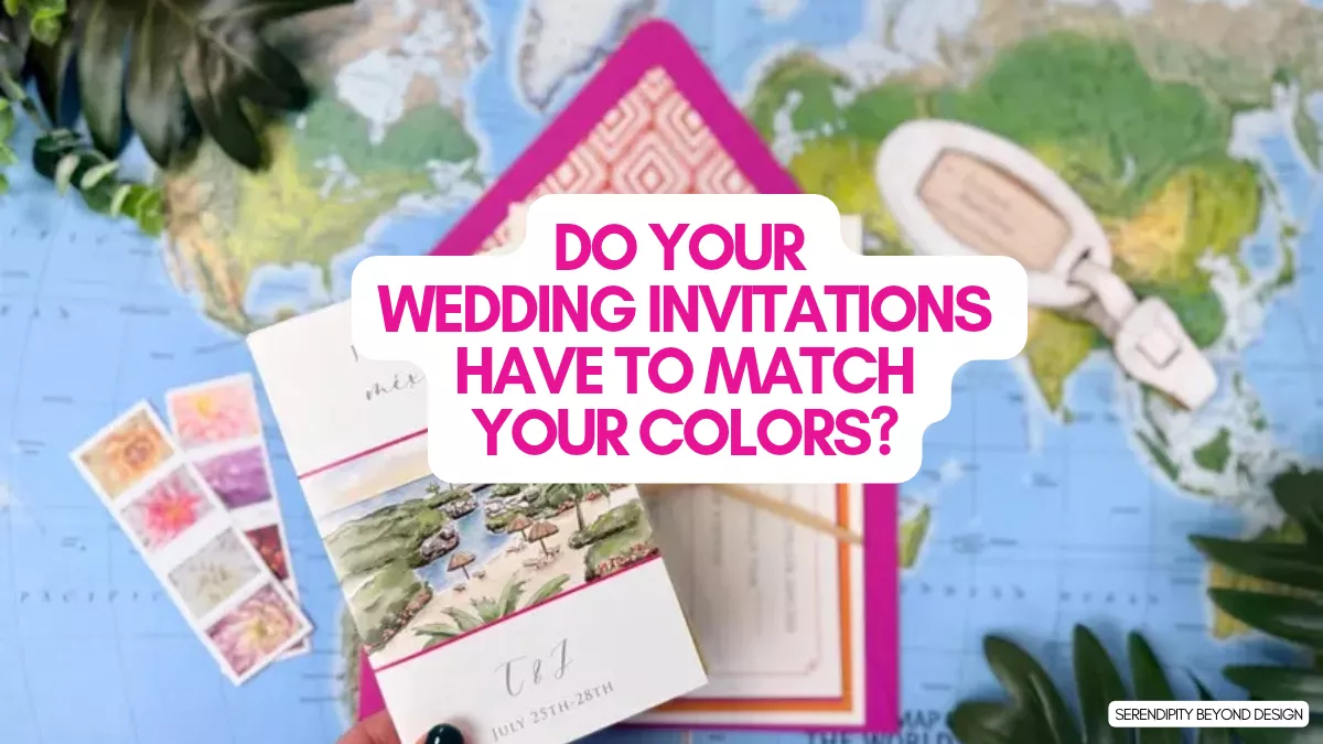
Should your wedding invitations match your wedding colors? Not necessarily! Your invitations should give guests a little preview of your celebration, but that doesn’t mean every shade has to match perfectly.
In fact, choosing invitation colors that complement your wedding palette can look even better than trying to find an exact match. A soft ivory invitation with sage green lettering, for example, can feel right at home at a sage green wedding without using the same shade on every detail.
Whether you’ve already picked your wedding colors or you’re still deciding between a few favorites, here’s how to choose wedding invitations that fit your style, coordinate with your palette and look beautiful when they arrive in the mail.
Do Wedding Invitations Have to Match Your Wedding Colors?
No! Wedding invitations do not have to match your wedding colors exactly. They should complement your overall wedding style, but they don’t need to use the same colors as your bridesmaid dresses, flowers, table linens or decorations.
Think of your invitations as the introduction to your wedding, not a color-matching test. They can reflect the mood of your celebration through their paper color, printing, typography, illustrations and envelope details.
For example:
- Planning a blush pink wedding? Try ivory invitations with dusty rose lettering, a soft pink envelope or delicate floral details.
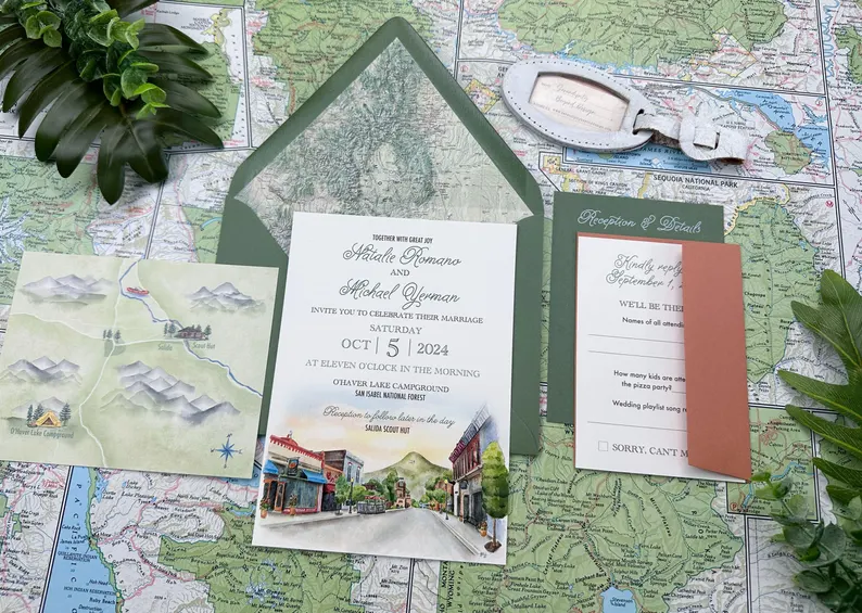
- Having a sage green wedding? Look for invitations with botanical illustrations, muted green accents or a neutral background.
- Choosing navy and gold? Consider a navy envelope with a cream invitation and gold foil details.
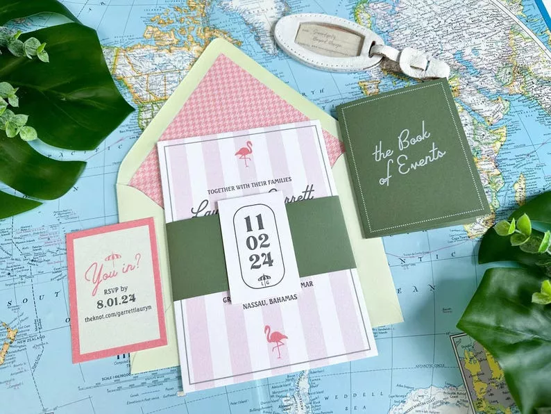
- Hosting a colorful garden wedding? Choose a floral design that incorporates several of your wedding colors rather than trying to match just one.
- Going with an all-white wedding? White, ivory, champagne and subtle metallic accents can create a beautiful, understated invitation suite.
The goal is to create a connection between your invitations and the celebration you’re planning. They don’t have to look identical to feel coordinated.
How to Choose Wedding Invitation Colors
Not sure where to start? These tips will help you narrow down your options without getting stuck trying to match every little detail.
1. Start With Your Overall Wedding Style
Before choosing invitation colors, think about the atmosphere you want your wedding to have. Is it romantic and elegant? Relaxed and rustic? Modern and minimalist? Color is one way to communicate that style before guests even arrive.
Here are a few ideas to get you started:
- Romantic wedding: Blush, dusty rose, mauve, ivory and champagne.
- Garden wedding: Sage, olive, soft pink, lavender and cream.
- Classic wedding: White, ivory, black, navy and gold.
- Modern wedding: Black, white, terracotta, taupe and unexpected color combinations.
- Rustic wedding: Warm neutrals, muted greens, brown, rust and soft blue.
- Coastal wedding: Blue, sea glass, sandy beige, white and soft aqua.
You don’t need to use every color in your wedding palette. Choose one or two shades that capture the feeling you want, then build your invitation design around them.
2. Choose a Neutral Base and Add Your Wedding Colors
If you’re worried about choosing the wrong shade, start with a neutral invitation. White, ivory, cream and soft beige work with just about any wedding palette.
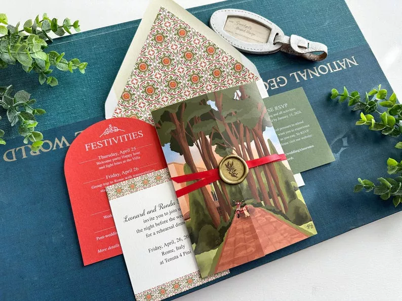
Then bring in your wedding colors through smaller details, such as:
- Colored envelopes
- Printed lettering or names
- Envelope liners
- Wax seals
- Ribbon or belly bands
- Floral illustrations
- Foil accents
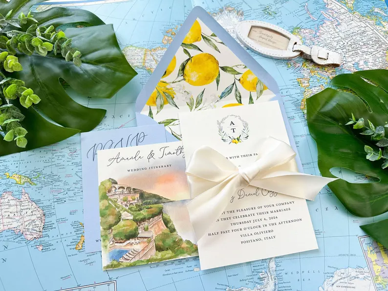
This approach gives you plenty of flexibility. You can use a neutral invitation with a colorful envelope, or choose a simple design with a small botanical illustration in your wedding colors.
It’s also a nice option if your palette includes several shades and you don’t want your invitation to look too busy.
Don’t Get Too Caught Up in Finding an Exact Shade
Let’s say your bridesmaid dresses are dusty rose, but the invitation you’ve fallen in love with comes in mauve. Or your wedding palette includes sage green, but the stationery company offers olive instead. Do you need to keep looking? Not necessarily!
Different shades can work beautifully together. In fact, using a little variation can make your wedding colors feel more layered and interesting. Think dusty rose with mauve, sage with olive, or navy with a softer blue-gray.
Instead of trying to find an exact color match, look at the undertones. Are the colors warm, cool, muted or bright? Shades with similar undertones tend to coordinate more naturally, even when they aren’t identical.
Make Sure Your Invitation Is Easy to Read
Pretty colors are important, but don’t sacrifice readability for a particular look. Pale lettering on a white background, for example, can be difficult to read, especially for older guests.
Look for enough contrast between the background and printed text. If you love a light or pastel design, darker lettering can help the names, date and other important details stand out.
This is another reason to order a printed sample. You’ll be able to see how the colors and lettering look on paper before ordering invitations for everyone on your guest list.
3. Think About Your Venue and Season
Your wedding venue and season can help guide your invitation colors, especially if you haven’t settled on a complete palette yet.
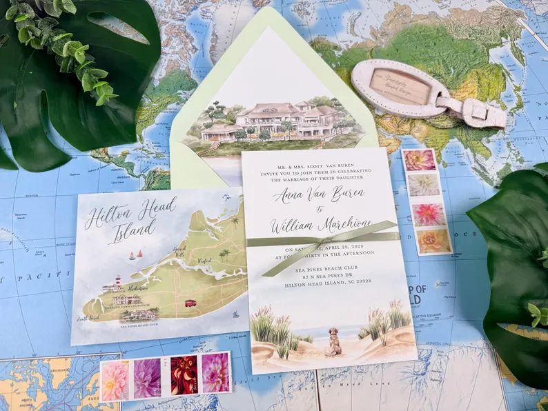
A beach wedding might inspire soft blues, sandy neutrals and sea glass green. A fall celebration could lean toward terracotta, burgundy, rust or warm brown. For a winter wedding, consider deep green, navy, charcoal, champagne or classic ivory.
Your venue can offer inspiration, too. A historic estate, garden, barn, modern loft and beachfront location all have different personalities. Your invitations can hint at the setting without needing to match the venue’s exact colors.
4. Consider the Colors That Will Appear in Your Photos
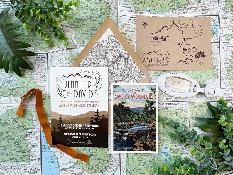
Your invitations are often photographed alongside other wedding details, including your rings, flowers, shoes and getting-ready accessories. If you want those photos to feel cohesive, think about how the invitation colors will look next to the details you’re already choosing.
For example, a warm ivory invitation with muted pink flowers can look beautiful alongside romantic wedding details. A clean white invitation with black lettering may be a better fit for a modern celebration.
You don’t need to coordinate every item in advance. Just consider whether the invitation design feels like it belongs with the overall look you’re creating.
5. Order a Printed Sample Before You Commit
This is one step I wouldn’t skip! A color that looks perfect on your computer or phone can look different when it’s printed on paper.
Paper texture, printing methods, lighting and screen settings can all affect how a color appears. A soft blush might look more peach in person, while a muted green might be darker than you expected.
Before ordering your full invitation quantity, request a sample if the stationery company offers one. Compare it with your bridesmaid dress swatches, fabric samples or other wedding colors in natural light.
You can also browse these free wedding invitation samples to compare paper, colors and printing before placing your order.
How to Coordinate Wedding Invitations Without Matching Everything
Sometimes the prettiest invitation designs aren’t available in your exact wedding colors. That’s okay! Instead of searching endlessly for a perfect match, look for a few design details that tie everything together.
Use a Similar Color Family
Colors don’t have to be identical to work well together. Try choosing shades from the same color family or pairing a softer version of one of your wedding colors with a deeper accent.
For example, if your wedding palette includes dusty blue, your invitations might use a pale blue background, navy lettering or a blue-gray envelope. Each shade is different, but they still feel connected.
Bring in a Wedding Color Through the Envelope
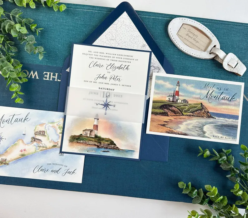
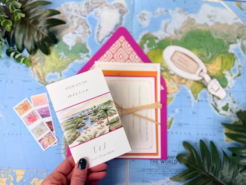
Your envelope is an easy place to add color without changing the invitation itself. Choose a colored envelope that coordinates with your palette, then keep the invitation simple with white or ivory paper.
This works especially well if you love a particular invitation design but it doesn’t come in your exact wedding colors.
Choose Florals or Illustrations That Include Your Palette
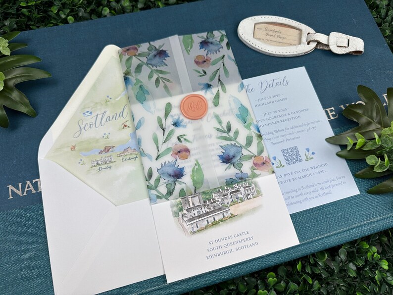
Floral invitations are a natural fit for garden weddings, spring celebrations and romantic themes. Look for a design that includes a few of your wedding colors, even if the background or lettering is a different shade.
Illustrations of greenery, flowers, venue details or other meaningful elements can also help connect your stationery to your wedding style.
Use Metallic Accents for a Little Extra Detail
Gold, silver, rose gold and other metallic details can add a polished touch to your invitation suite. They also work with a wide range of color palettes.
Gold foil can warm up an ivory invitation, while silver accents can feel especially lovely with cool blues, gray and white. You can use metallic details in the lettering, border, envelope liner or small design elements.
What If You Haven’t Chosen Your Wedding Colors Yet?
You don’t have to finalize your entire wedding palette before shopping for invitations. If you already know your general style, you can start looking at designs and save your favorites while you make other decisions.
Here are a few ways to keep your options open:
- Choose a neutral invitation. White, ivory and cream are easy to coordinate with colors you choose later.
- Look for customizable designs. Some stationery companies let you change the paper, ink, envelope or accent colors.
- Start with your favorite design. You may find an invitation you love first and use its colors as inspiration for the rest of your wedding.
- Wait on the final order. Save your favorite designs, but hold off on ordering until you’ve settled on the details you want to coordinate.
There’s no rule saying your wedding colors have to be chosen before your invitations. Give yourself room to make decisions in the order that works best for your planning timeline.
Should All Your Wedding Stationery Match?
Your save-the-dates, invitations, RSVP cards, details cards, menus and other wedding stationery don’t have to be identical. However, using a few consistent design elements can make everything feel like part of the same collection.
For a coordinated look, consider repeating:
- Colors: Use the same main shades or complementary colors throughout your stationery.
- Fonts: Repeat a favorite script or serif font for names, headings or other details.
- Illustrations: Carry a floral motif, greenery design or custom venue illustration across different pieces.
- Paper: Choose similar paper finishes or textures to give the suite a consistent feel.
- Design details: Repeat a border, monogram, motif or small decorative accent.
You can also keep your save-the-dates simple and use a more detailed design for your formal invitations. The pieces should feel related, not like copies of one another.
Wedding Invitation Color Ideas to Inspire You
Still deciding which direction to take? Here are a few color combinations that can help you picture your invitation style.
- Blush and ivory: Soft, romantic and timeless.
- Sage and cream: Natural, understated and lovely for garden weddings.
- Navy and champagne: Classic with a little elegance.
- Terracotta and dusty rose: Warm and inviting for an autumn celebration.
- Lavender and pale blue: Light, fresh and pretty for spring or summer.
- Black and white: Clean, modern and always appropriate for a formal celebration.
- Emerald and gold: Rich, dramatic and especially beautiful for an evening wedding.
- Blue and sandy beige: Relaxed and coastal without feeling overly themed.
Use these combinations as inspiration, not strict rules. You can always adjust the shades to fit your venue, flowers and personal taste.
Frequently Asked Questions About Wedding Invitation Colors
Should wedding invitations match bridesmaid dresses?
No. Your wedding invitations don’t need to match your bridesmaid dresses. You can use a complementary shade, a neutral background or a small accent color that ties the two together. If you want to compare the colors in person, keep a dress swatch nearby when reviewing printed invitation samples.
Should wedding invitations match the wedding theme?
Your invitations can reflect your wedding theme, but they don’t have to follow it literally. For a rustic wedding, you might choose botanical details or warm neutral colors. For a modern wedding, a simple design with clean typography may be enough. Think of your invitations as a preview of the celebration rather than a complete representation of every detail.
Can wedding invitations be a different color from the wedding decorations?
Yes! Your invitations can use different colors from your wedding decorations as long as the overall design feels intentional. A neutral invitation can work beautifully with colorful flowers, linens and reception decor. You don’t need to repeat every shade throughout your stationery and decorations.
When should I choose wedding invitation colors?
It’s helpful to have a general idea of your wedding colors and style before placing your invitation order. However, you don’t need every floral, linen and decor detail finalized. Choose a design that works with your overall vision, then order a printed sample before committing to the full quantity.
Should save-the-dates match wedding invitations?
They don’t have to match exactly. Using the same colors, fonts or design details can make your save-the-dates and invitations feel coordinated. You can also choose different designs that reflect the same overall wedding style.
Do wedding invitation colors look different when printed?
Yes. Colors can look different on printed invitations than they do on a computer or phone screen. Screen brightness, paper color, printing methods and paper texture can all affect the finished result. Request a printed sample whenever possible so you can see the actual paper and ink colors before placing your full order.
Ready to Choose Your Wedding Invitations?
Remember, your wedding invitations don’t need to match your wedding colors perfectly. Choose a design you love, look for colors and details that complement your celebration, and order a sample before placing your full order.
Once you’ve found a design you love, use this guide to what to include in your wedding invitations so your finished suite has all the information your guests need.
And if you’re still comparing stationery designs, take a look at these helpful resources:
- Where to Get Free Wedding Invitation Samples
- Best Wedding Invitation Websites
- Affordable Wedding Invitations That Look Beautiful
- Wedding Invitation Wording and Etiquette
Editor’s Note: If you loved the invitations throughout this post as we do, visit Ginger’s shop. SHE IS AMAZING! Check out Serendipity Beyond Design on Etsy →
Happy Planning!
xo
Emma