Here’s the solution to a common save the date problem I hear from couples all the time.
Many couples worry when they don’t have a color palette, theme, or a vision of their big day – yet they know they’re running out of time to send save the date cards.
(Tip: Here’s when you should send them.)
But rather than hastily picking out a color or theme, wait! The vision will come to you and you’ll feel more in control when you allow yourself time to discuss it as a couple. And while you’re waiting for the magic to hit you, you can send black and white save the dates to guests immediately.
You’ll be happy to get the task off of your mind and allow yourself more time to pick out the colors, patterns, motifs, and more later.
Black and white save the date cards are extremely versatile. They go with everything! This allows you ample time to put together your dream vision while still meeting your deadlines. You won’t be behind, guests will have enough advance notice of your big day, and you’ll stop stressing out.
Plus, your future color scheme or theme to come will seamlessly blend into any cards you send out.
As a bonus, grayscale cards are on trend: they don’t reveal your theme or colors just yet, so in a way, your big day is more of a secret. This can lead to an even bigger reveal for your guests on the day of (which can be fun!)
So now that you know how black and white save the dates can eliminate stress, it’s time to show you some brilliant examples.
While many couples turn to colorful prints and patterns, your monochrome save the dates will stand out – and I’ll show you how to maximize their impact. In this blog post, we’ll explore the beautiful yet monochrome world of black and white save the date cards to take yours up a notch.
Let’s get started!
The Classic Elegance of Black and White Save the Dates
Colorful patterns are great, but there’s much to be said about the simplicity of black and white and how it stands out, like vintage postcards or photographs buried in an attic or pasted in an old photo album. These timeless photographs and cards offer a sophistication you can’t find in the more modern styles, and that’s why couples are choosing this color palette for save the dates.
Make a Bold Statement
Monochrome styles aren’t boring; on the contrary, some of the black and white save the dates we’ve seen are more eye-catching and bold, thanks to the use of contrast and unique patterns to add visual interest and detail to the cards.
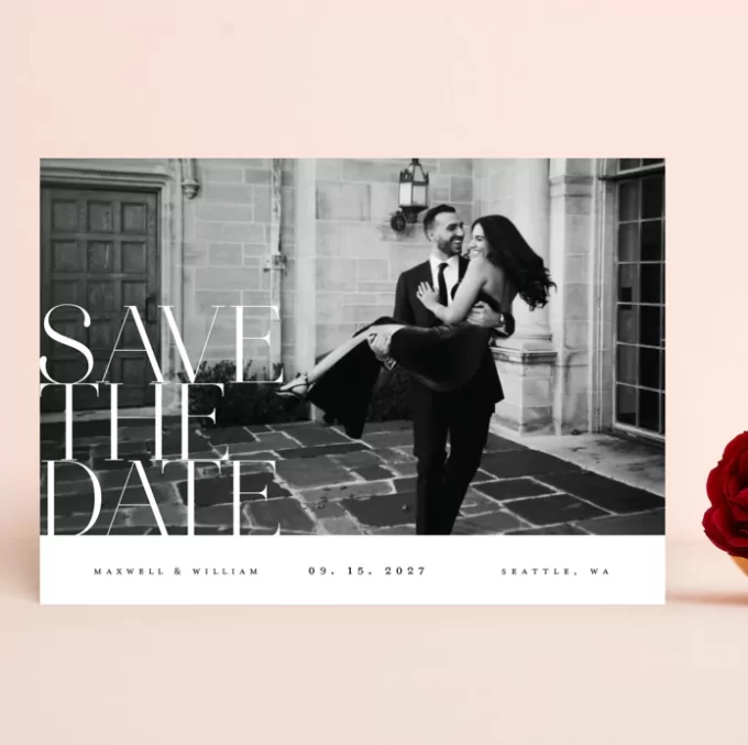
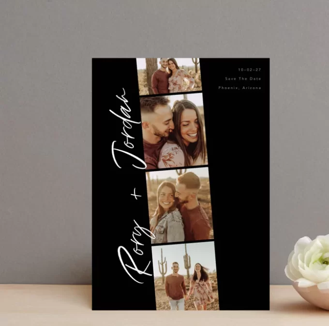
Incorporate your favorite photograph from your engagement shoot into your announcements. The card shown below looks like a newspaper or magazine feature – so good!
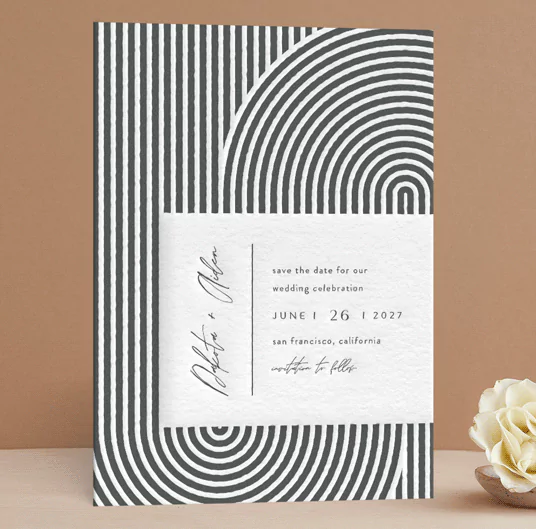
When you add a design element such as a flourish, motif, monogram, a splash of gold foil, or a unique pattern – like this swirl shown below – you’ll notice how grayscale save the dates can really pop.
Versatility
If you haven’t quite nailed down the color palette yet, or you’re unsure on your theme, black and white cards will make sending save the dates so easy! No more waiting around for you to decide the shades or hues – just find a design you love, and send it out. Monochrome will effortlessly coordinate with your future color palette or theme.
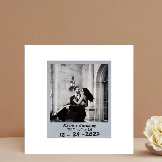
For example, here’s a photo save the date that offers a nice, simple black-and-white color scheme with a perfectly placed photograph.
PRO TIP: Save the dates should be sent approx. 6 to 9 months before the wedding (or up to 1 year for a destination wedding). Calculator your ideal mailing date here, free.
Examples of Black and White Save the Date Designs
Here are some samples of save the dates that offer this trending black-and-white modernism. As you’ll see in the examples below, the artists use creative text and typography on black and white save the dates to convey your message and add an elegant vibe.
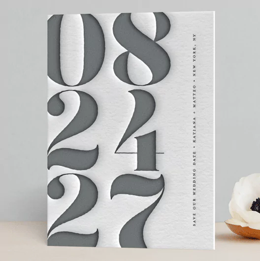
Mod Stack Letterpress
This letterpress style card has a raised texture you can feel. I love the simplicity of this black and white card showing off your date in big, bold numbers.
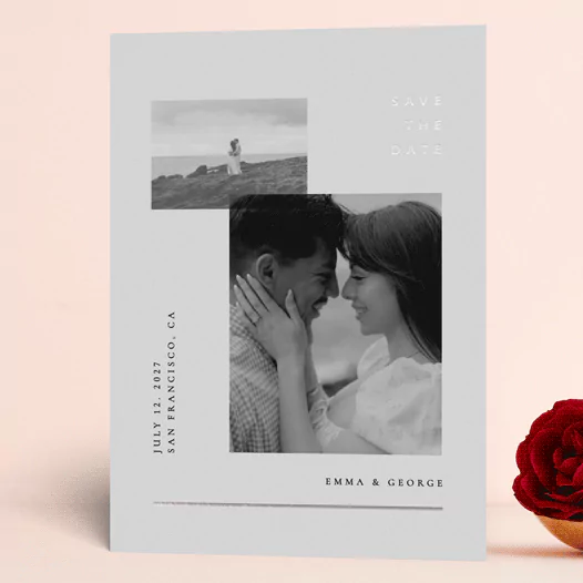
Simple Line Black Foil
A card like this can include two photos, elegant black foil that really shimmers and shines, and an elegant yet simple typeface.
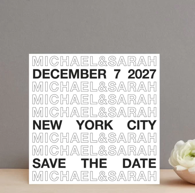
Be There or Be Square
A fun, bold design that really draws in your attention.
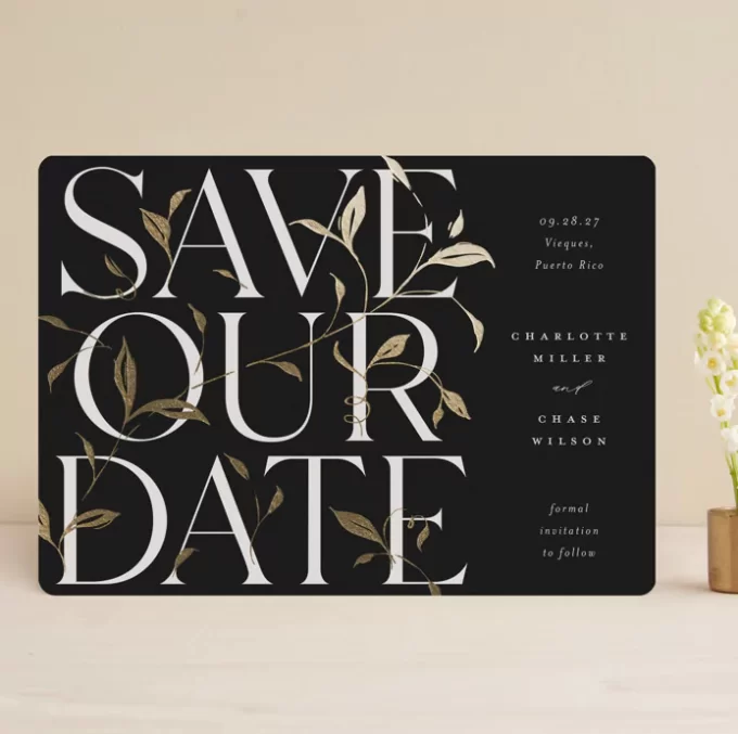
Garden Vines
Send your guests this elegant garden-inspired design with black and white and a hint of gold foil.
Photobooth Love
The contrast of the colorful photos against this black and white color palette makes the pictures and smiles stand out even more.
Signed
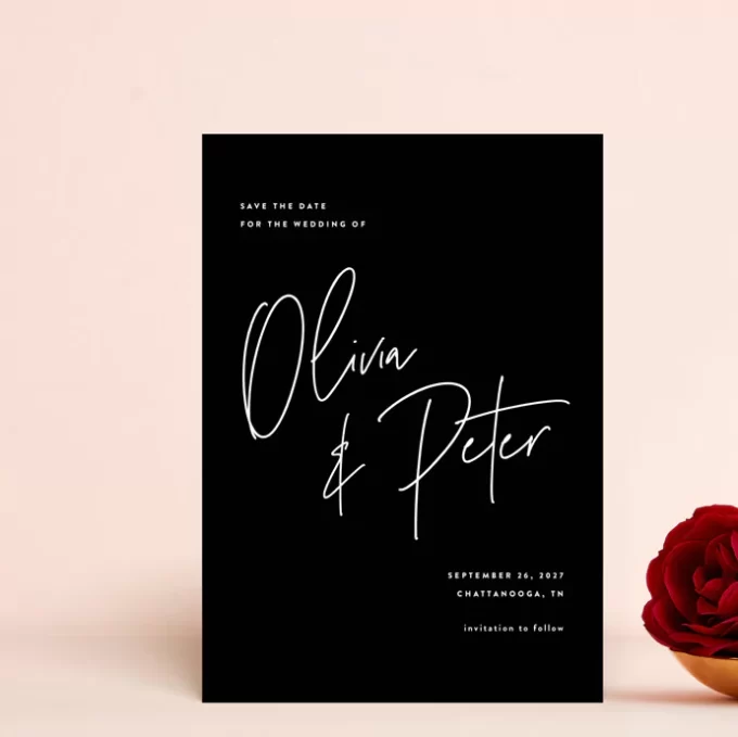
This elegant black card with white script lettering puts all the emphasis on your big day ahead – and the colors, styles, and themes that await your guests.
Incorporating Personal Touches in Black and White Save the Dates
Whether you opt for a colorful palette or you choose these styles, be sure to add your own personal touch. Guests love to see your smiling faces, places you like to go together, or a favorite past-time or hobby you do as a couple. So feel free to incorporate a photo or a few snapshots that tie in these elements.
► LOVE THESE AND WANT EVEN MORE INSPO? I hear you! Head over to Minted where we spotted these independent designs by artists (yay!) and explore their newest save the date creations. View them here. Minted offers premium designs and customization capabilities to bring your vision to life.
ON TO YOU: Now that you’ve had a chance to see some examples, what do you think? Is this a trend for you?
Let us know your thoughts on these monochromatic save the dates in the comment box below. We’d love to hear from you!
This is a sponsored post.
