
Good to know: Wedding welcome signs look expensive when they use clean typography, high-quality materials (like acrylic, wood, or linen), and simple wording. Avoid cluttered designs, low-contrast colors, and overly decorative fonts.
If you’re searching for wedding welcome signs that do not look cheap, you’re really asking one thing: how do I make my wedding look elevated without overspending?
The good news is that expensive-looking wedding signs are less about budget and more about design choices. A $40 sign can look more luxurious than a $300 one if it’s done right.
Here’s exactly how to choose wedding welcome signs that feel timeless, intentional, and high-end (without the luxury price tag).
And if you’re still deciding what your sign should say, check out our full guide to wedding welcome sign wording ideas with copy-and-paste examples you can use instantly. Let’s get started!
Top Picks: Elegant Wedding Welcome Signs
Best wedding welcome signs that don’t look cheap are usually minimalist acrylic, linen fabric, or natural wood designs with simple typography and neutral colors.
What Makes a Wedding Welcome Sign Look Expensive?
It’s not the price tag, it’s the design choices.
- Simple typography (clean serif or elegant script)
- Neutral color palettes (white, ivory, black, soft blush)
- High-quality materials like acrylic, wood, or fabric
- Minimal wording with strong spacing
- Good proportions (not too small or overcrowded)
When a sign feels calm and intentional, it instantly looks more expensive.
Choosing the right wording also matters — simple, intentional phrasing helps elevate your entire look (see examples in our wedding welcome sign wording guide).
Best Materials for Wedding Welcome Signs That Look Expensive
- Acrylic: Modern, clean, and reflective for a luxury finish
- Wood: Warm, timeless, and perfect for rustic or outdoor weddings
- Linen or fabric: Soft, editorial-style look that feels custom
- Mirror: Glamorous and high-impact for formal weddings
These materials instantly elevate even the simplest design and are the fastest way to avoid a “cheap” look.
Wedding Welcome Signs That Don’t Look Cheap (Best Styles)
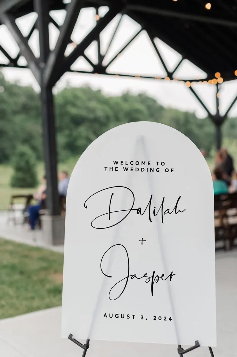
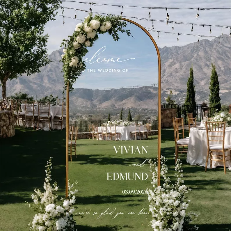
1. Acrylic Wedding Welcome Signs
Acrylic signs are the most popular “luxury look” choice right now. Clear, modern, and versatile, they work with almost any wedding theme.
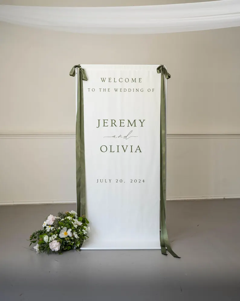
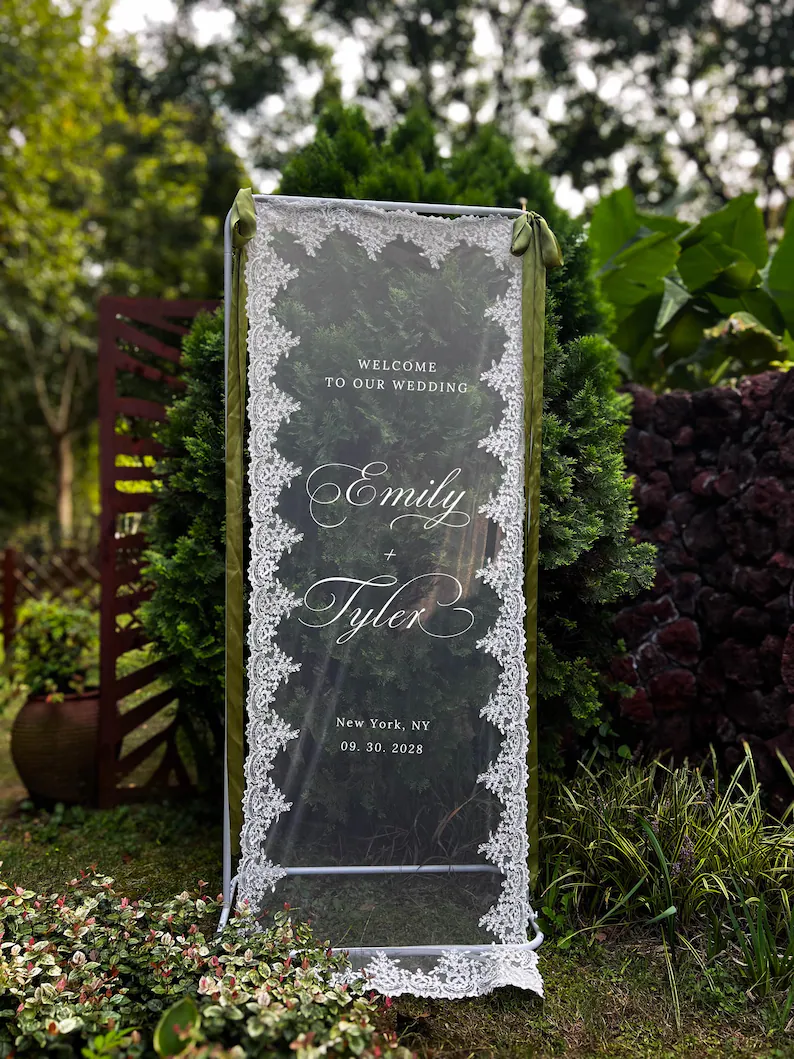
2. Fabric & Linen & Lace Wedding Signs
Soft fabric signs feel editorial, romantic, and high-end without trying too hard.
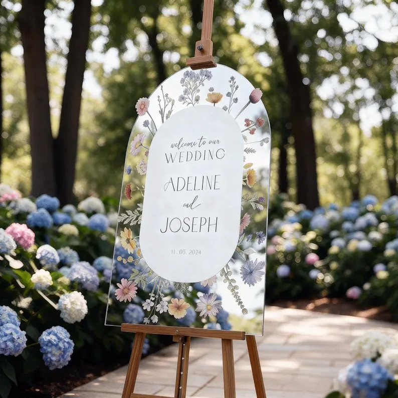
3. Mirror Wedding Welcome Signs
Mirror signs instantly add glamour and reflect light beautifully in photos.
PRO TIP: Get the decal here and a similar mirror here.
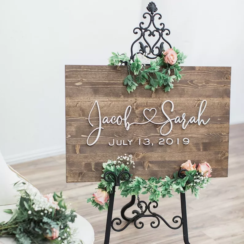
4. Wood Wedding Welcome Signs
Natural wood signs work best when kept minimal with clean lettering and no clutter.
What Makes Wedding Welcome Signs Look Cheap?
- Too many fonts or mismatched typography
- Bright, overly saturated colors
- Cluttered wording or long paragraphs
- Low-quality printing or pixelated graphics
- Small size that feels hard to read
When in doubt, simplify. Luxury design is usually about restraint.
How to Make a Budget Wedding Welcome Sign Look Expensive
- Stick to one font pairing (script + serif is ideal)
- Use neutral tones only
- Go bigger than you think you need (this is essential)
- Add minimal florals instead of heavy decoration
- Match your sign style to your wedding welcome sign wording
Designer tip: If you’re unsure, remove one design element before finalizing your sign. Minimal designs almost always look more expensive than detailed ones.
► Want more decor inspiration? Explore our full guide to must-have wedding signs for your ceremony and reception.
How Much Should a Wedding Welcome Sign Cost?
You don’t need a high budget to get a high-end look. Most wedding welcome signs fall into three tiers:
- $20–$60: Printable or simple fabric signs (best budget option)
- $60–$150: Acrylic, wood, or custom Etsy designs (best value)
- $150–$300+: Mirror or luxury custom calligraphy signs
The key isn’t spending more, it’s choosing the right materials and keeping the design minimal.
Common Mistakes That Make Wedding Welcome Signs Look Cheap
- Using too many fonts in one design
- Choosing bright or neon colors without balance
- Overloading the sign with text
- Using small sign sizes that are hard to read from a distance
- Choosing low-resolution or poorly printed designs
A simple design almost always looks more expensive than a detailed one.
FAQs About Wedding Welcome Signs That Don’t Look Cheap
What makes a wedding welcome sign look expensive?
Simple typography, neutral colors, high-quality materials, and minimal design make wedding welcome signs look expensive.
What is the most affordable elegant wedding sign style?
Fabric and acrylic wedding welcome signs are the best balance of affordability and high-end appearance.
Are DIY wedding welcome signs a good idea?
Yes, if kept minimal. DIY signs can look high-end when using clean fonts and quality materials.
More Wedding Welcome Sign Inspiration
If you’re still deciding on your style, take a look at a curated selection of wedding welcome signs that feel timeless, intentional, and beautifully designed. Sometimes seeing real examples is the easiest way to find your perfect fit.
From minimalist acrylic to romantic fabric and classic wood, there’s something for every wedding aesthetic.
If you want wedding welcome signs that don’t look cheap, keep it simple, intentional, and timeless. The most expensive-looking designs are almost always the most minimal.
Need help choosing what to say on your sign first? Start with our wedding welcome sign wording examples before picking your design.
xo, Emma